
Why I chose the movie
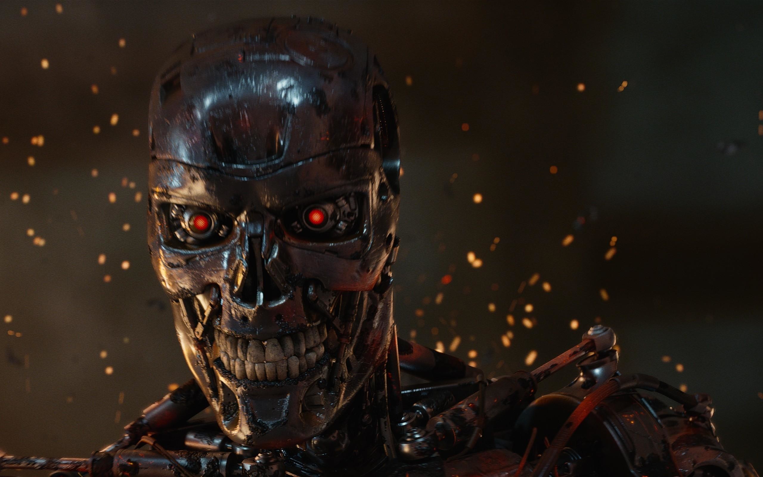
Terminator 2 (Judgement Day) was my favourite action movie growing up and it still resonates with me whenever I watch it again. Though, the storyline was a bit advanced for me at that time because it was portraying people coming back from the future to correct the present in order to prevent an imminent destruction of the human race in the future. The movie really helped me develop my creative skills as a young child then and I remembered hand drawing my first ever comic book after watching the movie for the first time. I chose this movie for the project because it is still one of the best action movies ever produced till date and the creativity deployed in making the movie is extraordinary.


My Design Rationale
The story and the mood of the movie inspired me to create an action-themed promotional website. This is just to give users a taste of what to expect from the movie when they visit the cinema. The aim is to draw them out to come and see the movie in the cinema.
The first step I took was coming up with the contents for the website. I carefully crafted contents sufficient for users to know about the movie and when it will be shown in the cinema. The contents then gave me an idea as to how to structure the website.
Next, I created a mood board from a collection of images. Remember, I had planned an action-themed website for the project so this helped me select the right images for my mood board. I then extracted colours from the collection of images to create my colour pallet for the project.


Next, I re-created the poster for the movie giving it a modern look and feel as the movie was initially released in the ’80s. I also used the opportunity to create the promotional flyer for the movie using the colours from my pallet and images gotten from the previous Terminator movies.


This poster then gave me an idea how my homepage for the website should look. How about replicating the poster design on the homepage of the promotional website. i.e. The way the design elements on the poster are arranged should look almost the same as the design elements on the website homepage. This will quickly resonate with people that have seen the posters somewhere before. so I decided to design the homepage like a replica of the poster. Then ,with an opportunity for users to watch the movie trailer and click on relevant links to showtimes and know more about the movie. This is to give them a taste of what to expect. I took out information that were unnecessary to the users. The aim is to draw them out to watch the movie in the cinema.

My choice of font is based on readability. I wanted to make it easy for users to read the information on the website. Though, I found the font used for the movie title available, it is however not suitable for headings in the case of the website. I decided to go for LORA for headings because it is legible for all font sizes. This will make headings readable even on the smallest of mobile devices. I chose POPPINS for body text because of readability as well. The character spacing of the poppins font makes it easy for users to read contents.

In the end, I was able to design the homepage which introduces the movie to the users with useful links to showtimes and interesting information about the movie. I also included the movie trailer to give users a taste of what the movie is all about. I designed the promotional website using the mobile first approach which makes it responsive on all devices. All images used for the website are well optimized for the project. I also maintained the action-themed outlook for the website. All in all, it was an interesting experience for the me.
Here’s a link to my design process and the earliest concept ideas for the project.